

How Using Microcopy Builds Better Products – 3 Key Qualities
By Team Reassemble with additional introduction by Kenneth Koh. Read more of their writings at: https://www.reassemble.io/resources
—
As developers of useful HR technology, we are always on the lookout for ways and means to enhance our product’s user experience (UX). Designing a product with a good UX is an endeavour that is seems simple, yet often is not.
Part of a good user experience design lies in the product’s copywriting; the words that are used on in the product itself. This is especially applicable to end-user software, like mobile apps. Enter the world of the microcopy. Microcopy, in a nutshell, refers to the little words and phrases that guide a user through their use journey on their app.
In today’s article, we present to you a piece on the powerful qualities good microcopy has. This write-up is by Singapore-based UX consultancy, Reassemble. If that name sounds familiar, this is because they were the ones who went viral for proposing some useful alternative designs to the much-derided MRT train displays.
Without further ado, here’s the piece. Enjoy.
—
Sometimes small phrases hold great power.

Why is Microcopy Important?
The other day someone told me a joke that stuck with me.
Jane’s my good friend.
She is a talented writer, and she dreamed of writing things that would make her readers shed tears of despair. Jane wanted them to weep and wail when they read her words.
I’m happy to say that she’s now living her dream!
She’s a freelance error message writer.
Microcopy, to use a definition from Kinneret Yifrah, refers to “The words or phrases in the user interface which are directly related to the actions a user takes”. This includes error messages, but also all the little bits of copy that guide, point out and follow user actions.
And they do have a major impact on user experience. Good microcopy is a subtle usher, a patient advisor, for a product’s users. Bad microcopy, on the other hand, can actively drive people away from a website or app.
Here are some of the aspects that, in our opinion, makes microcopy good.
Quality 1: Good Microcopy is Timely
What distinguishes good service in a restaurant?
Many restaurants have wait staff that are incredibly annoying because they never come to you. You’ve made your decision, you want to place the order, but they just don’t see you. They don’t come round to ask; they just don’t care.
What we really want is help that comes when we want it. A good waiter notices when we’ve closed the menu, and is already on the way when we look up. This is the same for microcopy.
Good microcopy is created with the user’s needs and context in mind. For example, look at Netflix’s Help Centre:
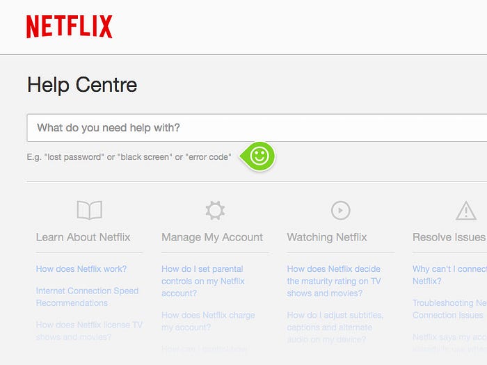
Think about it: no one goes to the Help Centre if everything is going okay. You’re here because something’s gone wrong halfway through your Jessica Jones binge. So you’re already frustrated and a little pissed off.
How would you feel if Netflix only showed you a blank search bar? So they don’t do that. They pay attention to the user’s context by:
- Being nice: Asking a question to guide the user.
- Providing advice: Listing out some common issues, to help your search.
Another example of microcopy that understands user context is with Wix and its purchase process:
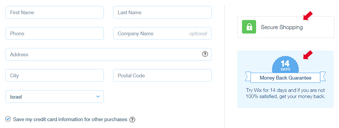
What with recent news and a renewed focus on security and privacy, it’s natural for users to be worried about giving their personal details. Then there’s also the natural worry about subscription purchases — will I be stuck paying if I don’t use the service anymore?
Wix’s microcopy helps to alleviate those fears by laying out its terms and capabilities, assuring users that their details are secure, and also that there is a 14 day money back guarantee. By putting their microcopy in the right place and time, Wix answers the users’ concerns at just the right time.
Quality 2: Good Microcopy is Action-Oriented
Going back to the joke that started this post: why exactly were error messages so annoying in the old days? It comes down to two things: users can’t understand it , and they can’t figure out what to do next.
Recall the above definition of microcopy: it is always directly related to an action. With that in mind, look at an infamous example of terrible microcopy:
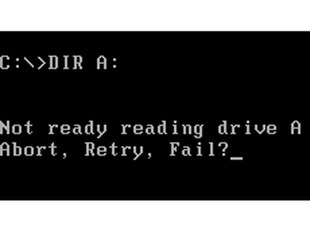
Ahhhhhhhhh
Okay, so… clearly something’s gone wrong and I need to do something. But what exactly?
What does the computer mean by ‘not ready’? What is ‘Abort’? How is ‘Abort’ different from ‘Fail’? Don’t they both mean to end something? Which one should I input? What should I do before I Retry?
So many questions, not a single answer. It’s no wonder people were weeping and rending their clothes.
Good microcopy, therefore, is action-oriented; it remembers that its job is to point the user towards doing something. Firstly, this means using clear, normal language as far as possible. Look at how Github does it:
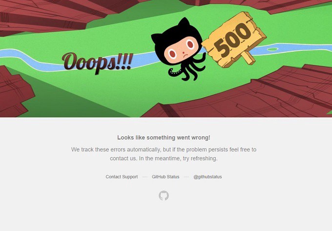
The technical information is there: some people do know what a 500 server error is. But for those who don’t, this provides:
- Information. Something went wrong.
- Reassurance. We track these errors automatically.
- Advice. Refresh. And if refresh doesn’t work, contact us (with a link).
As the user, I have answers to my questions, and I know what to do next. What could have been a big disruption to my work day is now no biggie. And that’s what microcopy does when it does its job.
Quality 3: Good Microcopy is Human
By now we’ve probably all heard the Google Duplex demo now: a machine that can actually converse, like a human, with a real human.
For some it probably brought out a bit of existential horror, but to me it makes good sense. As technology advances, it stands to reason that it should also become more human, or at least more understandable for humans.
And here’s where the human quality of good microcopy comes in. Microcopy should be functional. Good microcopy is functional — and, more than that, it’s conversational and human.
Consider the following: one from Font Awesome, a font and icon toolkit, and one from Tumblr.
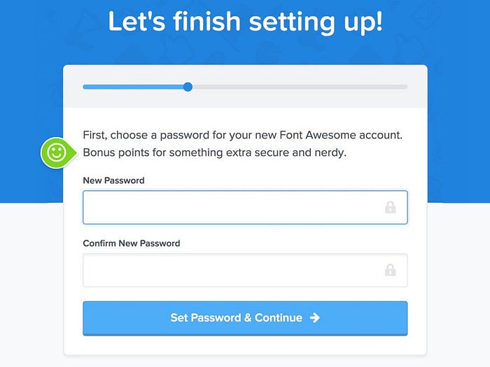
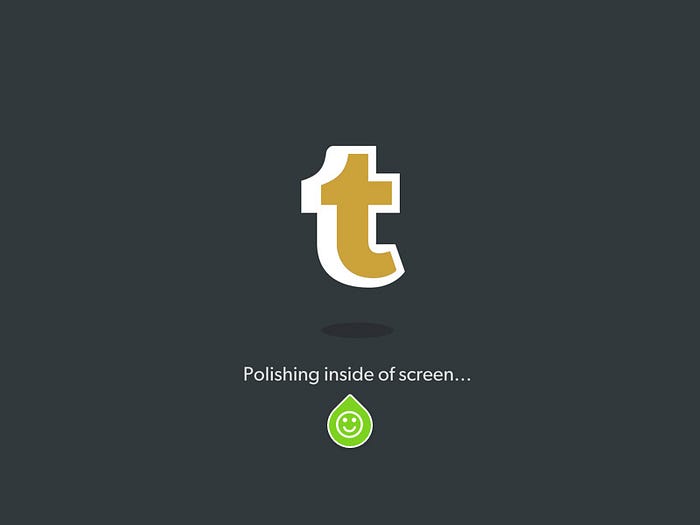
Microcopy should adhere to the tone and voice that the whole product is trying to achieve; after all, it is the content that the users will see the most.
Both examples above are concise and clear, providing feedback on the user’s actions: Font Awesome is getting you to sign up, while Tumblr is showing you that it’s loading your request. But more than that, they also do it with a quirkiness that makes them more human.
Good microcopy understands that people trust the things that can make them smile, and they try to bring that smile while doing their job.
Reading
- I’ve already mentioned Yifrah above, but it’s worth checking out her Medium as well.
- Good Microcopy is the source of some of my examples, and it’s a nice little compilation of good examples that guide and instruct and amuse users.
Sometimes the best way to see if microcopy works is to actively test it. You can take a look at how we include testing in our projects via our website, or get in touch through LinkedIn or Facebook.
IoTalents.com is an integrated platform for online Hirers and IT Workforce (Employees, Contract workers and Virtual Talents) to get intelligently connected and transact. We match companies to awesome talent, through a precise combination of data science and human judgement.